Twitter has had a redesign, and there are people in 2017 who are still using the word ‘gay’ to complain about it.
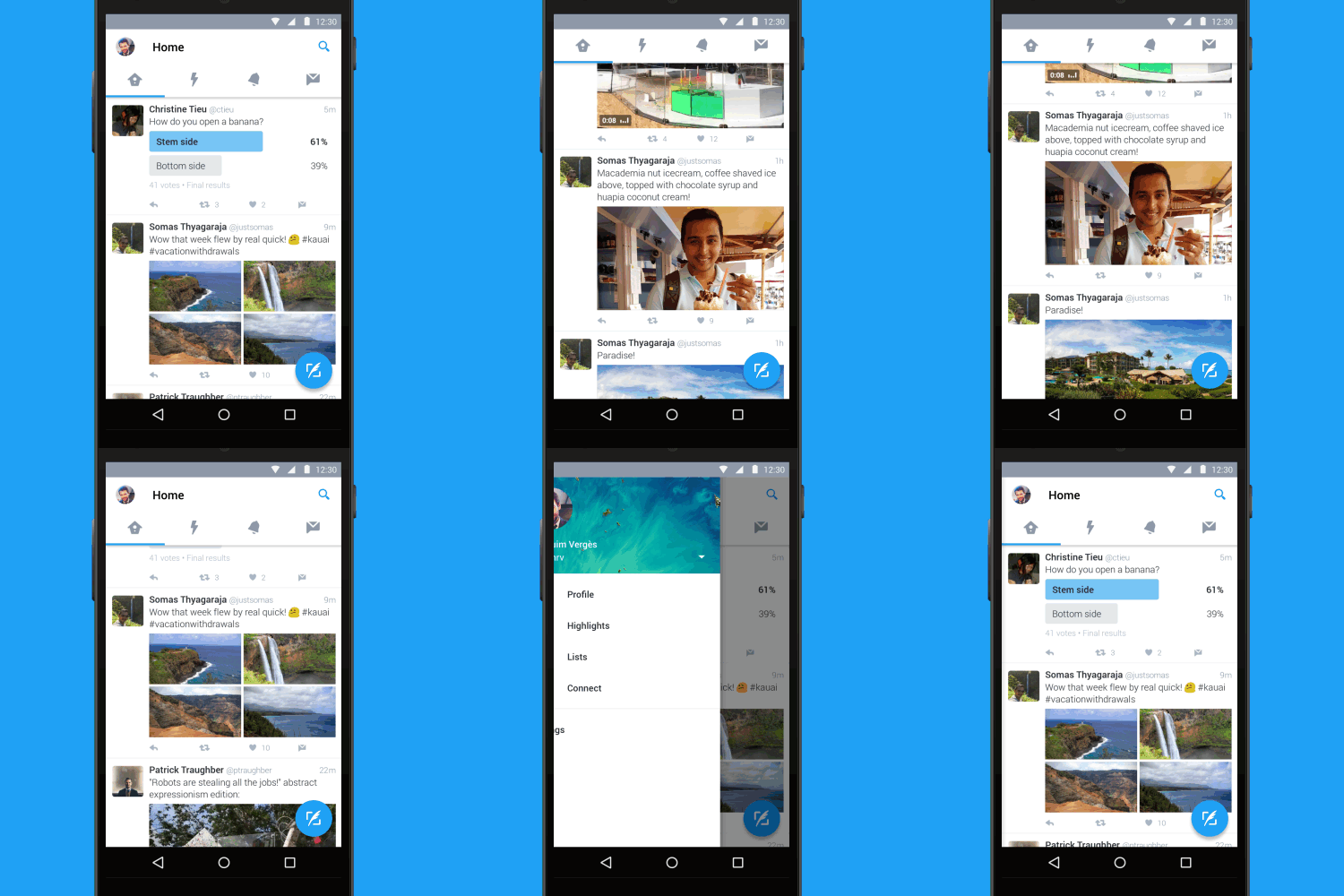
Updates to the social network’s iOS and Android apps, website and TweetDeck service include new fonts, bolder headlines, circular profile pictures and new menus.
The changes include:
- A font redesign including bolder section headlines
- Circular profile pictures
- A new profile section on iPhone, found by pressing your profile picture in the top left of the app instead of in the bar across the bottom
- A speech bubble instead of the curved arrow for replying to somebody and small changes to the like and retweet icons
- Live updates to retweet and like counts, so you can watch them go up in real-time on mobile apps
- Changes to how tweets with pictures are displayed when opened, making them full screen and including the tweet itself instead of just the picture
‘Today, with lots of feedback and ideas from you, we’re refreshing our product too and making it feel lighter, faster, and easier to use,’ Grace Kim, Twitter’s head of user research and design, said.
‘We listened closely and kept what you love. And for the things you didn’t, we took a new approach to fix and make better.’
As #NewTwitter started trending, and people started to complain, there were of course people that objected to the new design with some casual homophobia.
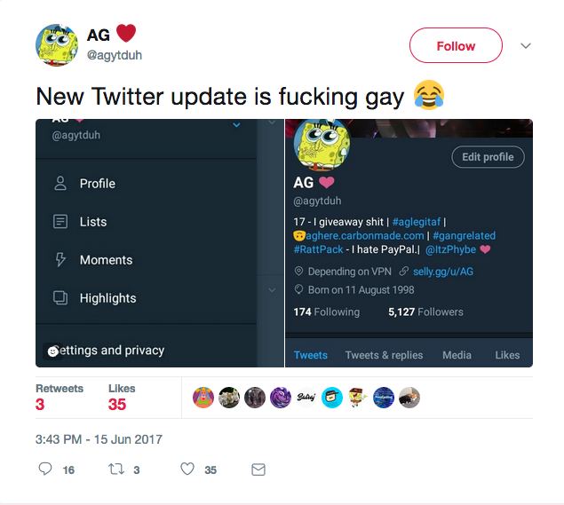
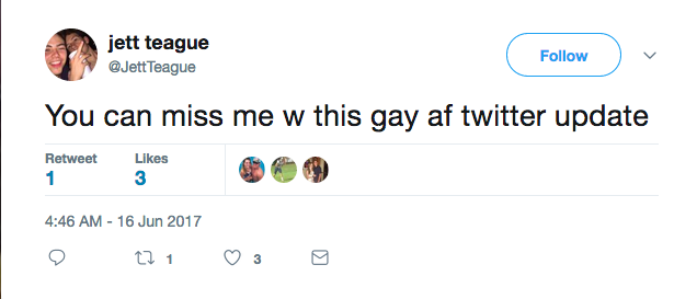
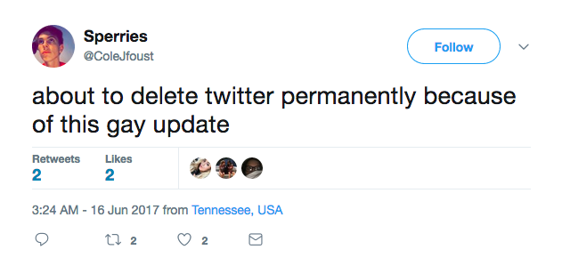
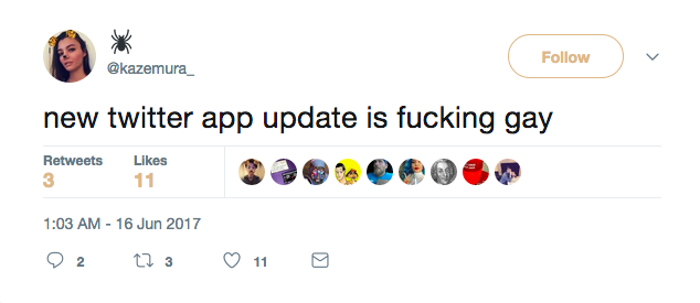
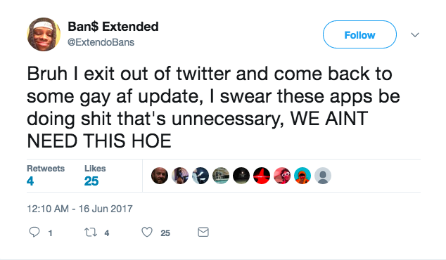
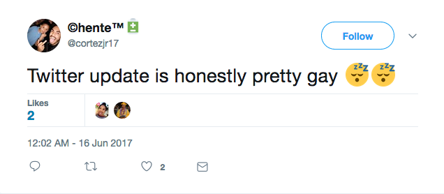
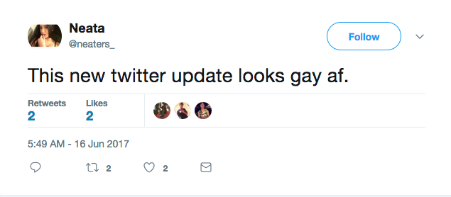
This isn’t unusual. The social media tracking site NoHomophobes reports an average of 15,000 uses of the phrase ‘no gay’ in a week. ‘Faggot’ was used around 30,000 times, ‘no homo’ about 27,000 times, and ‘dyke’ about 10,000 times in a week.
So if you need a reminder, these things are actually pretty gay.

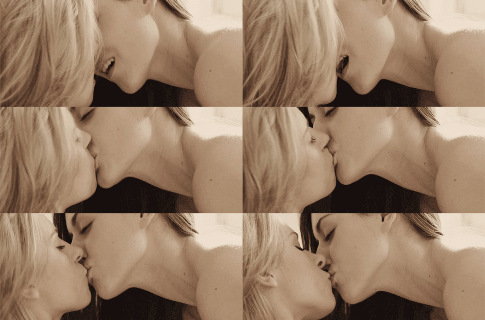
Do you know what’s not gay? This.
